At a Glance

Building ieso’s Design System

Creating a scalable foundation for consistent, accessible products across web and mobile

I built and evolved ieso’s design system across patient, clinician and operational products, defining its principles, tokens, components and guidance with Engineering so it worked in both design and production.

Role

Product Design Lead → Design Director

Focus

Design systems, accessibility, design–engineering alignment

Worked with

Engineering, Product, Design

When

2017–2026 · core system built 2020–2024

At a Glance

Building ieso’s Design System

Creating a scalable foundation for consistent, accessible products across web and mobile

I built and evolved ieso’s design system across patient, clinician and operational products, defining its principles, tokens, components and guidance with Engineering so it worked in both design and production.

Role

Product Design Lead → Design Director

Focus

Design systems, accessibility, design–engineering alignment

Worked with

Engineering, Product, Design

When

2017–2026 · core system built 2020–2024

At a Glance

Building ieso’s Design System

Creating a scalable foundation for consistent, accessible products across web and mobile

I built and evolved ieso’s design system across patient, clinician and operational products, defining its principles, tokens, components and guidance with Engineering so it worked in both design and production.

Role

Product Design Lead → Design Director

Focus

Design systems, accessibility, design–engineering alignment

Worked with

Engineering, Product, Design

When

2017–2026 · core system built 2020–2024

At a Glance

Building ieso’s Design System

Creating a scalable foundation for consistent, accessible products across web and mobile

I built and evolved ieso’s design system across patient, clinician and operational products, defining its principles, tokens, components and guidance with Engineering so it worked in both design and production.

Role

Product Design Lead → Design Director

Focus

Design systems, accessibility, design–engineering alignment

Worked with

Engineering, Product, Design

When

2017–2026 · core system built 2020–2024

At a Glance

Building ieso’s Design System

Creating a scalable foundation for consistent, accessible products across web and mobile

I built and evolved ieso’s design system across patient, clinician and operational products, defining its principles, tokens, components and guidance with Engineering so it worked in both design and production.

Role

Product Design Lead → Design Director

Focus

Design systems, accessibility, design–engineering alignment

Worked with

Engineering, Product, Design

When

2017–2026 · core system built 2020–2024

The Challenge

ieso’s patient, clinician and operational products had outgrown the existing component library. Experiences were drifting apart, the same accessibility issues kept recurring and teams were rebuilding similar solutions.

For Users

Create consistent, accessible experiences across products.

For Teams

Reduce ambiguity, duplication and repeated design work.

For ieso

Support new products, platforms and future growth.

My Contribution

Audited the live products and production components, exposing duplication, visual drift and accessibility failures.

Defined the principles, tokens, components and recurring patterns used across web and mobile.

Worked with Engineering to keep design and production components aligned.

The Impact

Greater Consistency

Unified experiences across patient, clinician and back-office products.

Less Repeated Work

Reusable components reduced the need to redesign and rebuild common interface patterns.

Accessibility Built In

Semantic foundations and documented states made accessible decisions easier to maintain.

Stronger Collaboration

A shared source of truth reduced ambiguity across Design, Engineering and Product.

The Challenge

ieso’s patient, clinician and operational products had outgrown the existing component library. Experiences were drifting apart, the same accessibility issues kept recurring and teams were rebuilding similar solutions.

For Users

Create consistent, accessible experiences across products.

For Teams

Reduce ambiguity, duplication and repeated design work.

For ieso

Support new products, platforms and future growth.

My Contribution

Audited the live products and production components, exposing duplication, visual drift and accessibility failures.

Defined the principles, tokens, components and recurring patterns used across web and mobile.

Worked with Engineering to keep design and production components aligned.

The Impact

Greater Consistency

Unified experiences across patient, clinician and back-office products.

Less Repeated Work

Reusable components reduced the need to redesign and rebuild common interface patterns.

Accessibility Built In

Semantic foundations and documented states made accessible decisions easier to maintain.

Stronger Collaboration

A shared source of truth reduced ambiguity across Design, Engineering and Product.

The Challenge

ieso’s patient, clinician and operational products had outgrown the existing component library. Experiences were drifting apart, the same accessibility issues kept recurring and teams were rebuilding similar solutions.

For Users

Create consistent, accessible experiences across products.

For Teams

Reduce ambiguity, duplication and repeated design work.

For ieso

Support new products, platforms and future growth.

My Contribution

Audited the live products and production components, exposing duplication, visual drift and accessibility failures.

Defined the principles, tokens, components and recurring patterns used across web and mobile.

Worked with Engineering to keep design and production components aligned.

The Impact

Greater Consistency

Unified experiences across patient, clinician and back-office products.

Less Repeated Work

Reusable components reduced the need to redesign and rebuild common interface patterns.

Accessibility Built In

Semantic foundations and documented states made accessible decisions easier to maintain.

Stronger Collaboration

A shared source of truth reduced ambiguity across Design, Engineering and Product.

The Challenge

ieso’s patient, clinician and operational products had outgrown the existing component library. Experiences were drifting apart, the same accessibility issues kept recurring and teams were rebuilding similar solutions.

For Users

Create consistent, accessible experiences across products.

For Teams

Reduce ambiguity, duplication and repeated design work.

For ieso

Support new products, platforms and future growth.

My Contribution

Audited the live products and production components, exposing duplication, visual drift and accessibility failures.

Defined the principles, tokens, components and recurring patterns used across web and mobile.

Worked with Engineering to keep design and production components aligned.

The Impact

Greater Consistency

Unified experiences across patient, clinician and back-office products.

Less Repeated Work

Reusable components reduced the need to redesign and rebuild common interface patterns.

Accessibility Built In

Semantic foundations and documented states made accessible decisions easier to maintain.

Stronger Collaboration

A shared source of truth reduced ambiguity across Design, Engineering and Product.

The Challenge

ieso’s patient, clinician and operational products had outgrown the existing component library. Experiences were drifting apart, the same accessibility issues kept recurring and teams were rebuilding similar solutions.

For Users

Create consistent, accessible experiences across products.

For Teams

Reduce ambiguity, duplication and repeated design work.

For ieso

Support new products, platforms and future growth.

My Contribution

Audited the live products and production components, exposing duplication, visual drift and accessibility failures.

Defined the principles, tokens, components and recurring patterns used across web and mobile.

Worked with Engineering to keep design and production components aligned.

The Impact

Greater Consistency

Unified experiences across patient, clinician and back-office products.

Less Repeated Work

Reusable components reduced the need to redesign and rebuild common interface patterns.

Accessibility Built In

Semantic foundations and documented states made accessible decisions easier to maintain.

Stronger Collaboration

A shared source of truth reduced ambiguity across Design, Engineering and Product.

From a Fragmented Library to a Shared System

The work began with an audit of the live products, then moved through shared principles, accessible foundations, reusable components and close work with Engineering to bring the system into production.

1

Auditing the Live Products

Brought every live component into one view, exposing duplication, missing states and accessibility gaps.

2

Setting the Foundations

Defined principles, tokens and guidance teams could apply in day-to-day work.

3

Building Reusable Components

Created flexible components and patterns for the cases teams actually encountered.

4

Keeping Design and Production Aligned

Worked with Engineering to keep the design library and production components aligned.

That’s the Short Version

Continue for a closer look at the audit, architecture and production decisions behind a more consistent, accessible design system.

From a Fragmented Library to a Shared System

The work began with an audit of the live products, then moved through shared principles, accessible foundations, reusable components and close work with Engineering to bring the system into production.

1

Auditing the Live Products

Brought every live component into one view, exposing duplication, missing states and accessibility gaps.

2

Setting the Foundations

Defined principles, tokens and guidance teams could apply in day-to-day work.

3

Building Reusable Components

Created flexible components and patterns for the cases teams actually encountered.

4

Keeping Design and Production Aligned

Worked with Engineering to keep the design library and production components aligned.

That’s the Short Version

Continue for a closer look at the audit, architecture and production decisions behind a more consistent, accessible design system.

From a Fragmented Library to a Shared System

The work began with an audit of the live products, then moved through shared principles, accessible foundations, reusable components and close work with Engineering to bring the system into production.

1

Auditing the Live Products

Brought every live component into one view, exposing duplication, missing states and accessibility gaps.

2

Setting the Foundations

Defined principles, tokens and guidance teams could apply in day-to-day work.

3

Building Reusable Components

Created flexible components and patterns for the cases teams actually encountered.

4

Keeping Design and Production Aligned

Worked with Engineering to keep the design library and production components aligned.

That’s the Short Version

Continue for a closer look at the audit, architecture and production decisions behind a more consistent, accessible design system.

From a Fragmented Library to a Shared System

The work began with an audit of the live products, then moved through shared principles, accessible foundations, reusable components and close work with Engineering to bring the system into production.

1

Auditing the Live Products

Brought every live component into one view, exposing duplication, missing states and accessibility gaps.

2

Setting the Foundations

Defined principles, tokens and guidance teams could apply in day-to-day work.

3

Building Reusable Components

Created flexible components and patterns for the cases teams actually encountered.

4

Keeping Design and Production Aligned

Worked with Engineering to keep the design library and production components aligned.

That’s the Short Version

Continue for a closer look at the audit, architecture and production decisions behind a more consistent, accessible design system.

From a Fragmented Library to a Shared System

The work began with an audit of the live products, then moved through shared principles, accessible foundations, reusable components and close work with Engineering to bring the system into production.

1

Auditing the Live Products

Brought every live component into one view, exposing duplication, missing states and accessibility gaps.

2

Setting the Foundations

Defined principles, tokens and guidance teams could apply in day-to-day work.

3

Building Reusable Components

Created flexible components and patterns for the cases teams actually encountered.

4

Keeping Design and Production Aligned

Worked with Engineering to keep the design library and production components aligned.

That’s the Short Version

Continue for a closer look at the audit, architecture and production decisions behind a more consistent, accessible design system.

Closer Look · About 5 min · 5 chapters

01

Auditing the Live Products

The design library showed the intended system. The live products showed where it had drifted, duplicated or broken down.

01

Auditing the Live Products

The design library showed the intended system. The live products showed where it had drifted, duplicated or broken down.

Putting the Live Products on One Page

ieso’s web products had outgrown the existing component library. Common patterns and states were missing, the same accessibility problems kept recurring and there was little guidance on when to use each component. Designers worked around the gaps; engineers rebuilt similar solutions.

I recorded every component in production and brought them together on one page. Seeing everything together made duplication, inconsistent styling and missing states easy to discuss. Design and Engineering could agree what to keep, combine or rebuild.

The production audit made duplication, inconsistent styling and missing states visible in one place.

The production audit made duplication, inconsistent styling and missing states visible in one place

02

Defining Principles Teams Could Use

The new system needed shared rules for making consistent, accessible decisions—not just a new set of components.

02

Defining Principles Teams Could Use

The new system needed shared rules for making consistent, accessible decisions—not just a new set of components.

Connecting Principles to Real User Needs

A component library could standardise the interface, but it could not tell a team why one choice was better than another. I ran a cross-disciplinary workshop to agree principles that could guide decisions across patient, clinician and operational products.
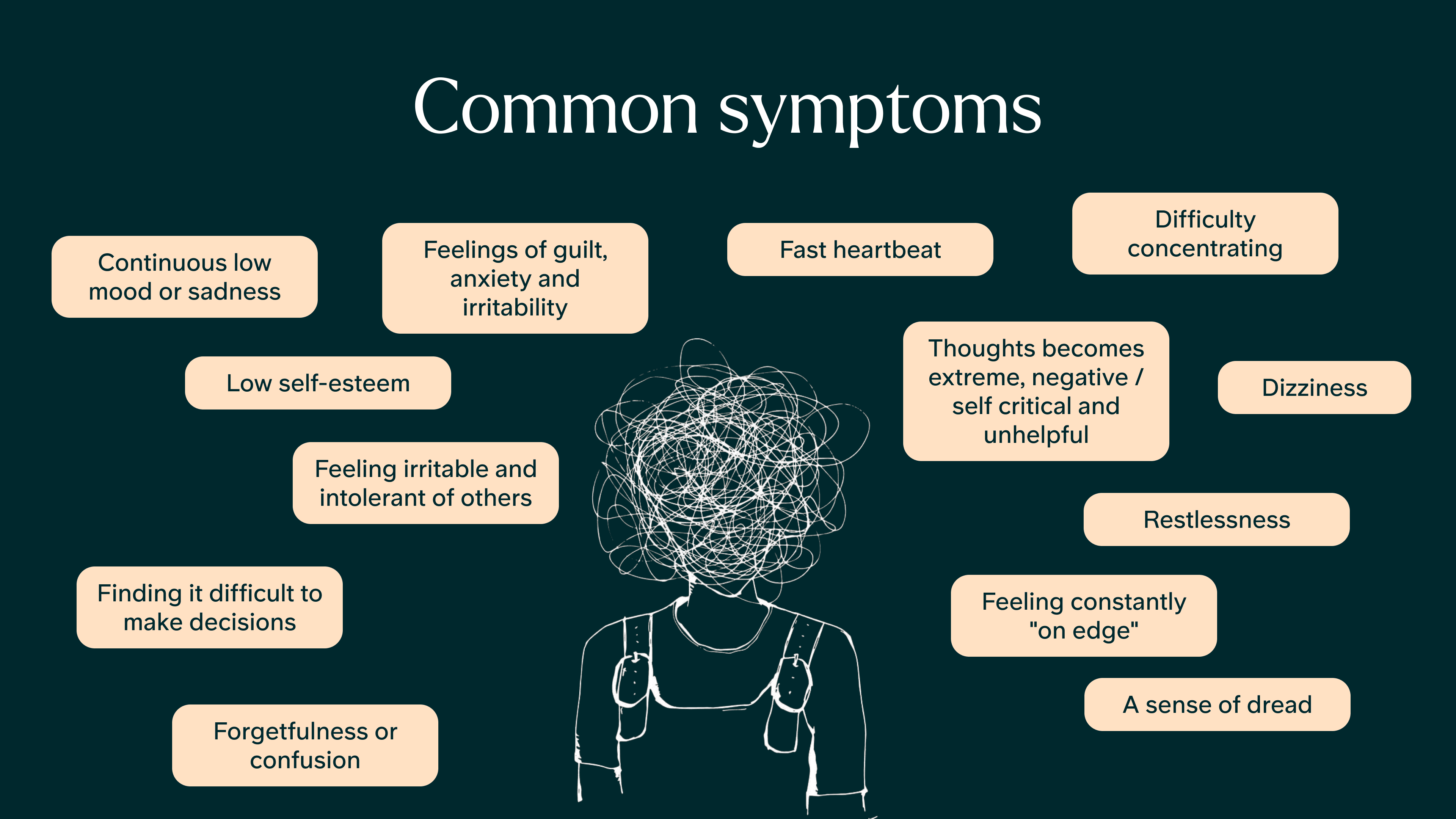
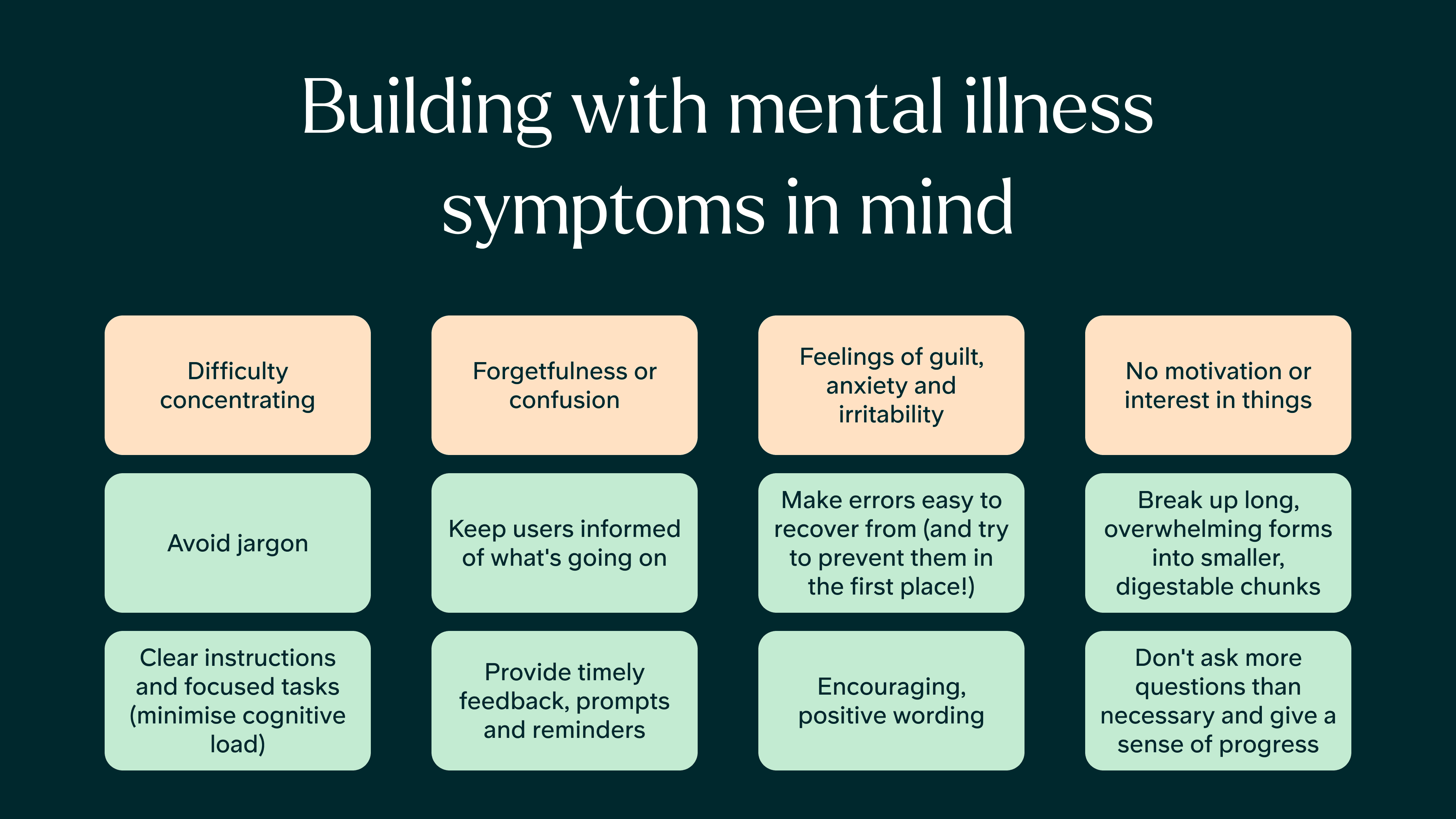
A cross-disciplinary workshop connected design principles to symptoms and real product decisions.

A cross-disciplinary workshop connected design principles to symptoms and real product decisions

03

Defining the System Architecture

The principles needed a clear structure that showed how shared foundations, product libraries and guidance fitted together.

03

Defining the System Architecture

The principles needed a clear structure that showed how shared foundations, product libraries and guidance fitted together.

Mapping How the System Fit Together

Once the principles were agreed, I mapped how the different parts of the system would fit together. Research and feedback informed the principles. Those principles shaped shared foundations such as colour, typography, spacing and core components. Product libraries then combined those foundations into patterns, layouts and templates for mobile, web and marketing.

This gave Design and Engineering a shared way to decide what belonged in the common foundations, what needed to remain product-specific and where guidance and accessibility documentation should live.

A shared architecture connecting research and principles to foundations and product-specific libraries.

A shared architecture connecting research and principles to foundations and product-specific libraries

04

Building Accessibility Into the Foundations

Could the foundations make the accessible choice the obvious one?

04

Building Accessibility Into the Foundations

Could the foundations make the accessible choice the obvious one?

Making Contrast Predictable

The old palette used steps that looked equally light on paper but not on screen. Contrast was unpredictable, so every colour pairing had to be checked separately.

I rebuilt the palette using a perceptually uniform colour model, then defined accessible pairings and semantic names. The accessible choice became the easy one to make, while light and dark themes remained part of the same system.

A perceptually uniform palette made contrast more predictable across different hues.

A perceptually uniform palette made contrast more predictable across different hues

Built-in contrast checks helped designers choose colour combinations that met accessibility requirements as they worked.

Built-in contrast checks helped designers choose colour combinations that met accessibility requirements as they worked

Giving Tokens a Clear Job

I structured tokens in layers: raw values, named primitives, semantic intent and component use. Changing what ‘brand primary’ meant became one edit rather than a search across products.

The same approach covered spacing, corner radius, typography, shadows and opacity—the small choices that drift when everyone makes them independently. Dark mode later arrived as token variants rather than a second system.

A layered token structure linked raw values to shared styles and individual components, making changes easier to apply consistently.

A layered token structure linked raw values to shared styles and individual components, making changes easier to apply consistently

The same semantic tokens switched to appropriate colour values in light and dark modes, without maintaining two separate systems.

The same semantic tokens switched to appropriate colour values in light and dark modes, without maintaining two separate systems

05

Keeping Design and Production Aligned

The design library and production code needed to describe the same components, states and behaviour.

05

Keeping Design and Production Aligned

The design library and production code needed to describe the same components, states and behaviour.

Designing Components That Behaved Like the Product

I built component properties, variants and states to mirror how they worked in the product. Usage and accessibility notes sat alongside each component, including focus order and screen-reader behaviour.

Design components used the same properties and states as their production counterparts.

Design components used the same properties and states as their production counterparts

Component documentation explained what each component was for, when to use it and how it should behave.

Component documentation explained what each component was for, when to use it and how it should behave

Maintaining One Shared System

Engineering built the production components around the same properties and states. We kept design and implementation aligned through regular design-system sessions, typography audits and shared naming.

The value became especially clear when Velora moved towards white-labelling. Rather than rebuilding every component for each partner, the same semantic foundations could map one supplied brand colour to a set of accessible states.

An early production component library documented in Storybook.

An early production component library documented in Storybook

Reflection

Much of a design system’s value is quiet. It is the component nobody rebuilds, the contrast issue that never reaches a patient and the decision a team no longer has to debate. The important part was not only creating a better library, but changing the foundations that kept producing the same problems.

The clearest proof came later, when the same foundations gave Velora’s white-labelling work a practical starting point. Work that began as a consistency and accessibility project also made new product directions easier to pursue.

Reflection

Much of a design system’s value is quiet. It is the component nobody rebuilds, the contrast issue that never reaches a patient and the decision a team no longer has to debate. The important part was not only creating a better library, but changing the foundations that kept producing the same problems.

The clearest proof came later, when the same foundations gave Velora’s white-labelling work a practical starting point. Work that began as a consistency and accessibility project also made new product directions easier to pursue.

© 2026 - Jack Larner