


Closer Look · About 6 min · 5 chapters
What the Friction Was Costing
Over the years, the Clinician Therapy Site—the web app therapists used to deliver care—had become a patchwork. Essential information was buried, navigation was difficult and unclear controls created operational problems, including incorrect availability and the extra scheduling work it created.
Clinicians spent paid session time on admin and workarounds. Patients could feel that their therapist had not remembered them. Some clinicians were moving to competitors with better tools. Rebuilding the platform mattered to care, retention and the business.

The old Clinician Therapy Site buried essential information in dense pages and unclear navigation
What Clinicians Needed Before and During a Session
With the Senior Clinical team, I mapped the appointment flow, then interviewed and shadowed clinicians with different levels of experience. I looked at what happened before they logged into ieso, how they prepared and what they needed once an appointment began.
They needed to understand the person, their condition, progress and goals, alongside anything personal or medical that might shape the conversation. The platform scattered that context across pages with no clear hierarchy. Under time pressure, many skipped preparation or kept several tabs open during sessions just to find what they needed.

Persona work and shadowing helped separate differences in confidence and working habits from job titles
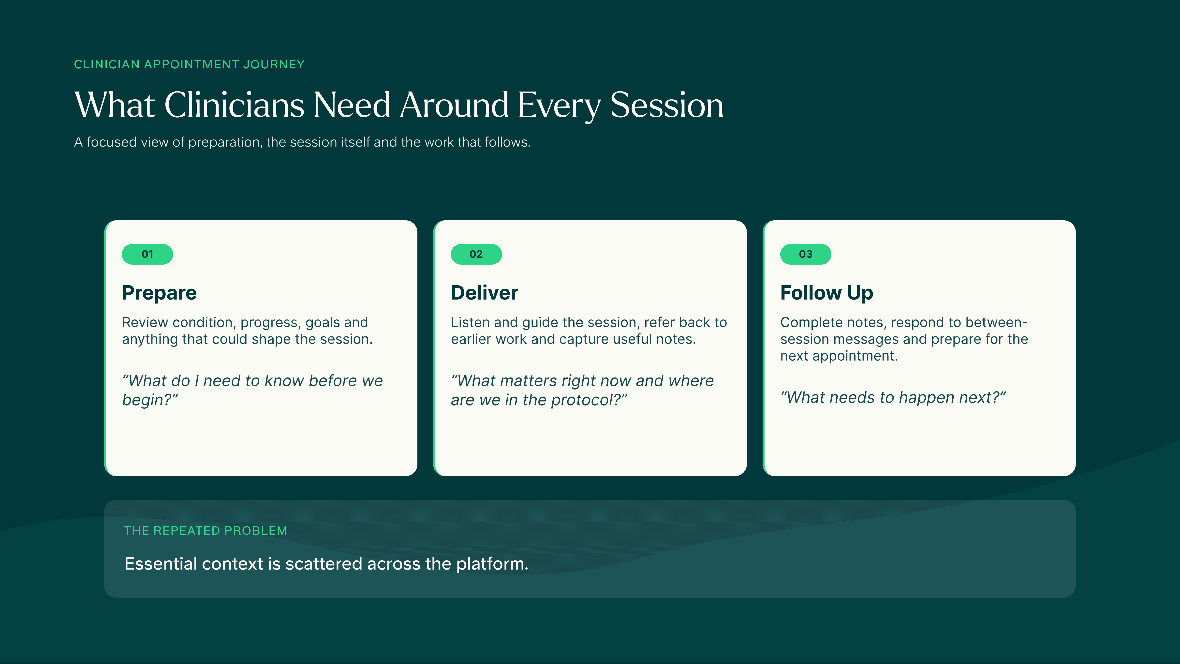
Mapping the appointment journey showed how preparation, the session itself and follow-up all depended on information scattered across the platform
Designing Around the Whole Working Day
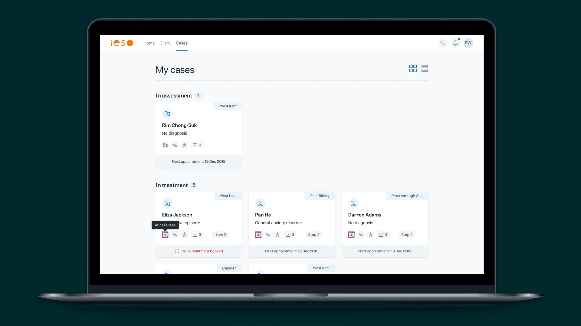
The research pointed to more than a better session screen. I mapped a simpler platform around the clinician’s working day: a home for upcoming appointments and urgent tasks, clearer ways to find and understand cases, and a diary that made schedules and availability easier to manage. These screens formed a North Star for the platform, rather than a promise that everything would ship at once. They gave Product, Clinical and Engineering something concrete to prioritise from. Two needs moved forward: keeping essential information close during sessions, and making preparation faster between them.


From a Wider Vision to a Focused Release
Within that wider platform direction, I explored what a better therapy session could support. Clinicians repeatedly needed questionnaire scores and previous notes while talking to a patient, so I prototyped a session view that kept this information beside the conversation. The broader prototype also explored shared exercises and easier access to patient details and progress.
It helped the Product Owner and me agree what the session experience should support before deciding what version one actually needed.

Clinicians had to juggle multiple tabs to access key information during appointments

The broader session prototype brought together patient details, treatment progress, clinical notes and therapeutic exercises that research showed clinicians needed during appointments
Shipping the Two Most Useful Tabs
Version one deliberately focused on two tabs in the side panel: overview information and clinical questionnaires. These were the things clinicians reached for most during sessions.
Twelve volunteer therapists used the interface live for two weeks. We fixed a subtle online-status indicator and unclear formatting controls before a staged regional rollout. Within a month, it was live for every ieso therapist.

The released session interface kept the conversation and essential case information in one view
4.39/5
average score for accessing information quickly in the beta survey
4.59/5
average score for usefulness during sessions in a post-release survey
Bringing Preparation Into One View
The Case Overview Dashboard brought together treatment details and severity, personal and medical information, questionnaire trends, overdue actions and links to the underlying case history.
Clinicians valued the time saved in testing, and supervisors valued reminders that reduced the need to chase overdue actions. However, company priorities shifted towards the patient experience, putting the project on hold. The research and tested design remained useful in partner demonstrations and later clinician work.

The tested Case Overview Dashboard brought preparation, progress and outstanding actions together
