




Closer Look · About 5 min · 5 chapters
Understanding Who Velora Needed to Work For
Velora began with a question: could evidence-based therapy be delivered effectively by AI? Answering it took more than an interface. The product had to keep the therapy effective, feel credible and engaging to the people using it, and be worth paying for.
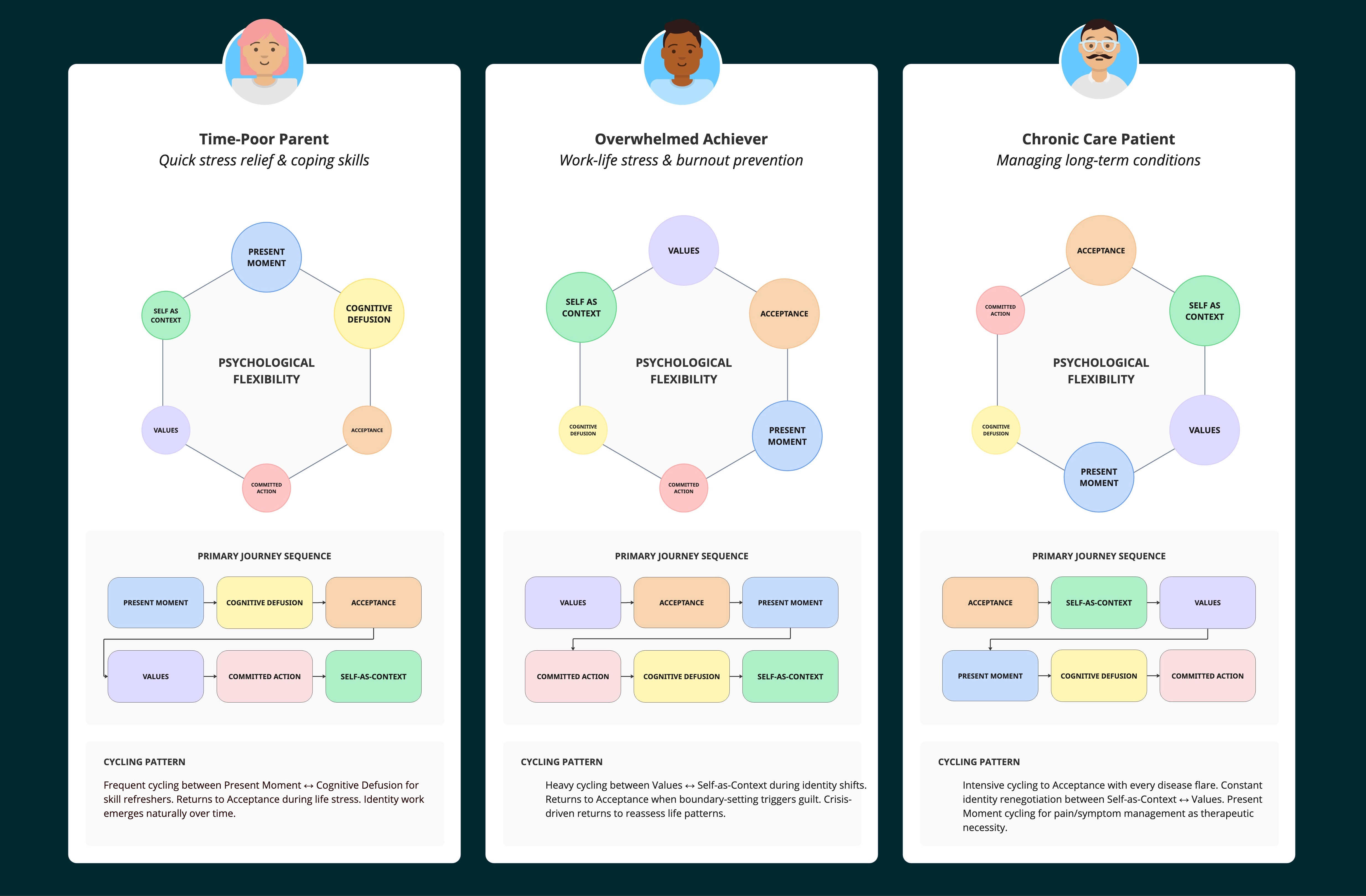
Working with Research, I drew on findings from 62 moderated interviews across the UK and US. They helped define who the product was for, how it could fit in their lives and how the experience needed to feel. Those findings shaped the tone of voice, session pacing, visuals and content, and the segments we designed for.

Segments and design principles defined from lived-experience research
Where the Market Fell Short
A competitive audit found plenty of mental health apps offering tools and content, but very few offering structured, outcome-driven guidance. We chose to build a clinically grounded programme with a clear path through it, rather than another library of exercises.
Designing for the Buyer as Well as the Patient
With Business Development, I mapped the clinical, technical, financial and product roles involved in a provider’s decision, then built messaging for each stage. It kept the buyer’s questions visible while we designed and later helped shape how Velora was offered to partners.

A competitor audit revealed the gap that set the direction: guidance towards an outcome, not another library of tools
First Model
Therapy, Translated
The first programme mirrored conventional therapy closely: six weeks, a fixed schedule, longer sessions. Clinically it was complete, and parts of it tested well. End to end, engagement fell away.
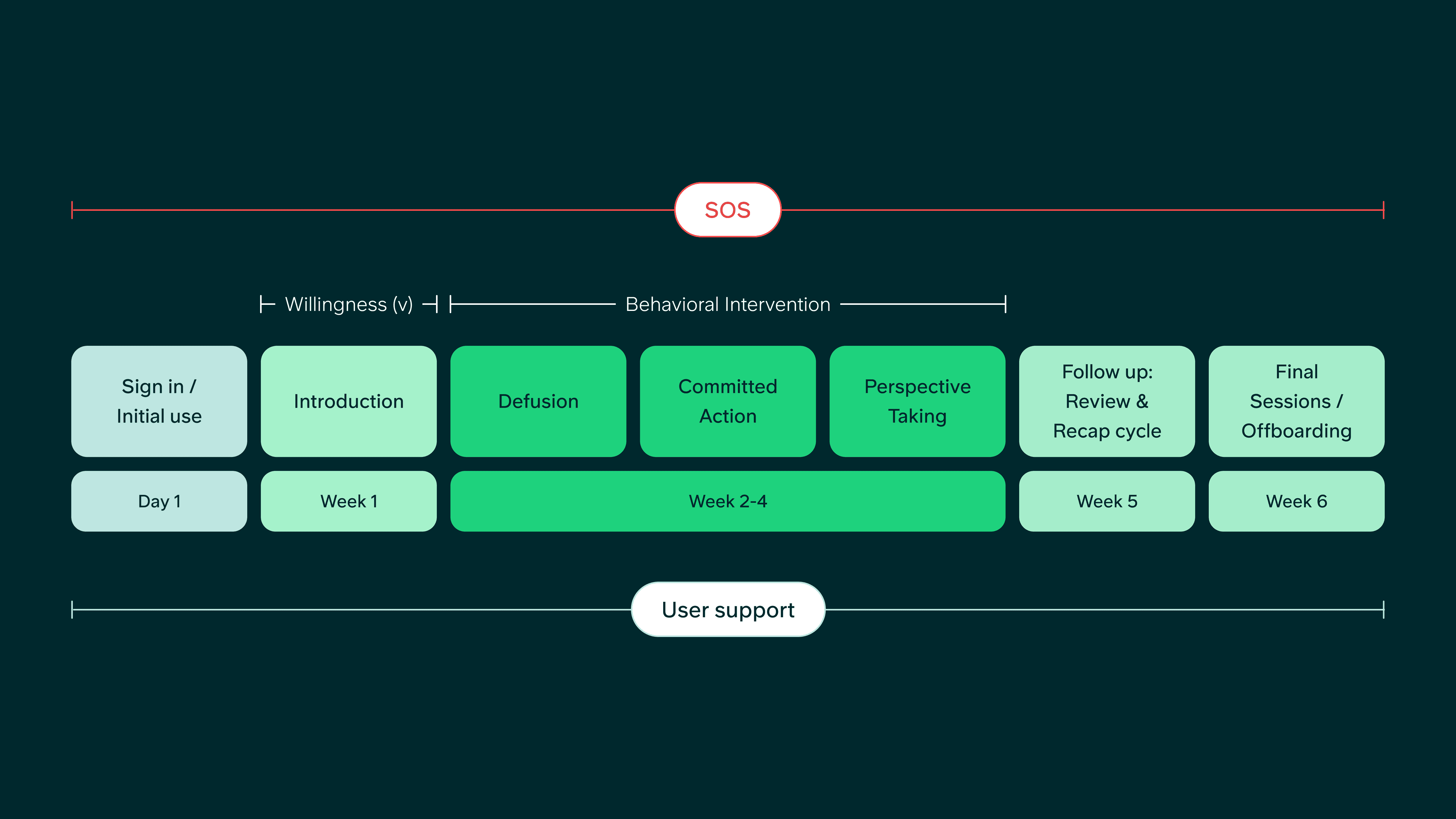
Programme v1 — a fixed six-week structure with longer scheduled sessions

One Programme, Several Delivery Models
As provider conversations progressed, we blueprinted hybrid variants — where clinical and non-clinical human support could sit alongside the AI — so the same programme could flex to different customers without being redesigned each time.

Service blueprint — where human support enters the programme
Working with Clinical and Engineering, I defined the purpose, user goals and required elements for each screen before moving into detailed design. That kept the structure grounded in what people needed, rather than becoming a collection of features. The app settled around three main parts:
Today
What should I do now?
My Journey
How far have I come?
Therapy Room
Where do sessions happen?
Together, they made a fairly involved care programme easier to understand without exposing all its complexity at once. I also explored several visual directions before settling on one that felt warm, calm and human — clinically credible, without feeling clinical.

Three parts, each answering a different question: what should I do now, how far have I come, and where do sessions happen?
Research and product data showed where people still stalled: before their first session, between sessions, when they were asked to give a fuller response, and when it was time to practise. Those moments became the focus for the next round of iteration.


The smallest change with the biggest result
Letting People Talk Instead of Type
The therapy agent worked better when people gave longer, more detailed answers. That is hard work on a phone. A full audio experience was out of scope, so I redesigned the text input to make the phone’s own speech-to-text one tap away. Live product data from a customer deployment showed how readily people took it up.
42%
of users used speech-to-text
28%
of users used it more than typing

Input detail — message composer with the mic affordance visible
Ending Each Session with a Clear Next Step
Ending a session was another chance to support the programme’s rhythm. Foundations sessions encouraged people to carry straight on while momentum was high. Practice sessions did the opposite: they suggested taking a day or two to try the exercise, with a reminder ready for the next session.

Different endings for different jobs: keep going through Foundations, or pause long enough to practise.
Usability and experience
Usable, Supportive and Worthwhile
A UK pragmatic study of 299 participants evaluated the anxiety programme. It scored 78.6 on the System Usability Scale, and around 89% of participants reported being satisfied. The interviews added context: people valued the structured but flexible experience, the sense of being guided while still in control, and the availability of human support. The clearest opportunity was deeper personalisation.
78.6
System Usability Scale
~89%
reported being satisfied
~300
UK participants
Safety and effectiveness
Early Evidence of Safety and Effectiveness
A US single-arm proof-of-concept study analysed outcomes for 81 adults. After around 90 minutes of use, more than half achieved clinically meaningful improvements in anxiety and depression, with effect sizes above 1.0. More than 80% reported feeling safe, supported and guided. No harmful outputs were observed in live use, and deterioration rates remained within expected bounds for psychotherapy.
~90 min
of interaction
>50%
achieved clinically meaningful improvement
80%+
felt safe, supported and guided

Carrying the core experience into a white-labelled responsive web app
