At a glance
Creating the Velora Brand
Giving ieso’s AI-led therapy programme a clear consumer identity—and later a flexible family of offers.
For almost two years, ieso’s AI-led therapy programme had no public identity and several internal names. I created Velora’s core visual identity, worked with Marketing on the name and positioning, then partnered with our Brand Designer to bring it into the product, presentations and campaigns.

Role
Design Director
Focus
Creative direction, visual identity, brand-in-product
Worked with
Marketing, Brand Design, Product
When
2025—2026
At a glance
Creating the Velora Brand
Giving ieso’s AI-led therapy programme a clear consumer identity—and later a flexible family of offers.
For almost two years, ieso’s AI-led therapy programme had no public identity and several internal names. I created Velora’s core visual identity, worked with Marketing on the name and positioning, then partnered with our Brand Designer to bring it into the product, presentations and campaigns.
Role
Design Director
Focus
Creative direction, visual identity, brand-in-product
Worked with
Marketing, Brand Design, Product
When
2025—2026
At a glance
Creating the Velora Brand
Giving ieso’s AI-led therapy programme a clear consumer identity—and later a flexible family of offers.
For almost two years, ieso’s AI-led therapy programme had no public identity and several internal names. I created Velora’s core visual identity, worked with Marketing on the name and positioning, then partnered with our Brand Designer to bring it into the product, presentations and campaigns.
Role
Design Director
Focus
Creative direction, visual identity, brand-in-product
Worked with
Marketing, Brand Design, Product
When
2025—2026
At a glance
Creating the Velora Brand
Giving ieso’s AI-led therapy programme a clear consumer identity—and later a flexible family of offers.
For almost two years, ieso’s AI-led therapy programme had no public identity and several internal names. I created Velora’s core visual identity, worked with Marketing on the name and positioning, then partnered with our Brand Designer to bring it into the product, presentations and campaigns.
Role
Design Director
Focus
Creative direction, visual identity, brand-in-product
Worked with
Marketing, Brand Design, Product
When
2025—2026
At a glance
Creating the Velora Brand
Giving ieso’s AI-led therapy programme a clear consumer identity—and later a flexible family of offers.
For almost two years, ieso’s AI-led therapy programme had no public identity and several internal names. I created Velora’s core visual identity, worked with Marketing on the name and positioning, then partnered with our Brand Designer to bring it into the product, presentations and campaigns.
Role
Design Director
Focus
Creative direction, visual identity, brand-in-product
Worked with
Marketing, Brand Design, Product
When
2025—2026
The Challenge
Give an established but unnamed AI therapy programme a clear consumer identity, replacing inconsistent internal descriptions with one recognisable product story.
For People
Make an unfamiliar form of therapy feel warm, credible and approachable.
For the Product
Give an emerging concept a recognisable character inside the experience.
For Commercial Teams
Present a clear, credible product story to healthcare partners.
My Contribution
Designed the core identity: logo, colour palette and photography style.
Ran naming and positioning work with Marketing, translating broad principles into a direction that balanced clinical credibility with warmth.
Carried the identity into the product, so it held up in the experience rather than only in marketing.
Worked with our Brand Designer on the wider rollout, including guidelines, templates and campaign assets.
The Impact
A Recognisable Identity
A shared name, wordmark, palette and photography style for the product.
A Clearer Product Story
Naming and positioning gave teams one way to introduce Velora to partners and stakeholders.
Consistent Inside the Product
The identity reached the interface, not only the marketing site and the deck.
A Flexible Product Family
Empower, Extend and Evaluate gave related product offers distinct roles within one coherent system.
The Challenge
Give an established but unnamed AI therapy programme a clear consumer identity, replacing inconsistent internal descriptions with one recognisable product story.
For People
Make an unfamiliar form of therapy feel warm, credible and approachable.
For the Product
Give an emerging concept a recognisable character inside the experience.
For Commercial Teams
Present a clear, credible product story to healthcare partners.
My Contribution
Designed the core identity: logo, colour palette and photography style.
Ran naming and positioning work with Marketing, translating broad principles into a direction that balanced clinical credibility with warmth.
Carried the identity into the product, so it held up in the experience rather than only in marketing.
Worked with our Brand Designer on the wider rollout, including guidelines, templates and campaign assets.
The Impact
A Recognisable Identity
A shared name, wordmark, palette and photography style for the product.
A Clearer Product Story
Naming and positioning gave teams one way to introduce Velora to partners and stakeholders.
Consistent Inside the Product
The identity reached the interface, not only the marketing site and the deck.
A Flexible Product Family
Empower, Extend and Evaluate gave related product offers distinct roles within one coherent system.
The Challenge
Give an established but unnamed AI therapy programme a clear consumer identity, replacing inconsistent internal descriptions with one recognisable product story.
For People
Make an unfamiliar form of therapy feel warm, credible and approachable.
For the Product
Give an emerging concept a recognisable character inside the experience.
For Commercial Teams
Present a clear, credible product story to healthcare partners.
My Contribution
Designed the core identity: logo, colour palette and photography style.
Ran naming and positioning work with Marketing, translating broad principles into a direction that balanced clinical credibility with warmth.
Carried the identity into the product, so it held up in the experience rather than only in marketing.
Worked with our Brand Designer on the wider rollout, including guidelines, templates and campaign assets.
The Impact
A Recognisable Identity
A shared name, wordmark, palette and photography style for the product.
A Clearer Product Story
Naming and positioning gave teams one way to introduce Velora to partners and stakeholders.
Consistent Inside the Product
The identity reached the interface, not only the marketing site and the deck.
A Flexible Product Family
Empower, Extend and Evaluate gave related product offers distinct roles within one coherent system.
The Challenge
Give an established but unnamed AI therapy programme a clear consumer identity, replacing inconsistent internal descriptions with one recognisable product story.
For People
Make an unfamiliar form of therapy feel warm, credible and approachable.
For the Product
Give an emerging concept a recognisable character inside the experience.
For Commercial Teams
Present a clear, credible product story to healthcare partners.
My Contribution
Designed the core identity: logo, colour palette and photography style.
Ran naming and positioning work with Marketing, translating broad principles into a direction that balanced clinical credibility with warmth.
Carried the identity into the product, so it held up in the experience rather than only in marketing.
Worked with our Brand Designer on the wider rollout, including guidelines, templates and campaign assets.
The Impact
A Recognisable Identity
A shared name, wordmark, palette and photography style for the product.
A Clearer Product Story
Naming and positioning gave teams one way to introduce Velora to partners and stakeholders.
Consistent Inside the Product
The identity reached the interface, not only the marketing site and the deck.
A Flexible Product Family
Empower, Extend and Evaluate gave related product offers distinct roles within one coherent system.
The Challenge
Give an established but unnamed AI therapy programme a clear consumer identity, replacing inconsistent internal descriptions with one recognisable product story.
For People
Make an unfamiliar form of therapy feel warm, credible and approachable.
For the Product
Give an emerging concept a recognisable character inside the experience.
For Commercial Teams
Present a clear, credible product story to healthcare partners.
My Contribution
Designed the core identity: logo, colour palette and photography style.
Ran naming and positioning work with Marketing, translating broad principles into a direction that balanced clinical credibility with warmth.
Carried the identity into the product, so it held up in the experience rather than only in marketing.
Worked with our Brand Designer on the wider rollout, including guidelines, templates and campaign assets.
The Impact
A Recognisable Identity
A shared name, wordmark, palette and photography style for the product.
A Clearer Product Story
Naming and positioning gave teams one way to introduce Velora to partners and stakeholders.
Consistent Inside the Product
The identity reached the interface, not only the marketing site and the deck.
A Flexible Product Family
Empower, Extend and Evaluate gave related product offers distinct roles within one coherent system.
From Broad Principles to a Distinctive Brand
A collaborative process to turn an early set of marketing principles into a warm, credible and flexible identity for Velora.


1
Clarifying the Brand Direction
Translated broad principles into a clearer personality and creative direction that balanced clinical credibility with warmth and optimism.

2
Developing the Visual Identity
Created the logo, colour palette and photography style that gave Velora a distinctive and recognisable character.

3
Connecting Brand and Product
Worked across brand and product design so the identity felt coherent inside the experience, rather than applied only through marketing.
4
Growing into a Product Family
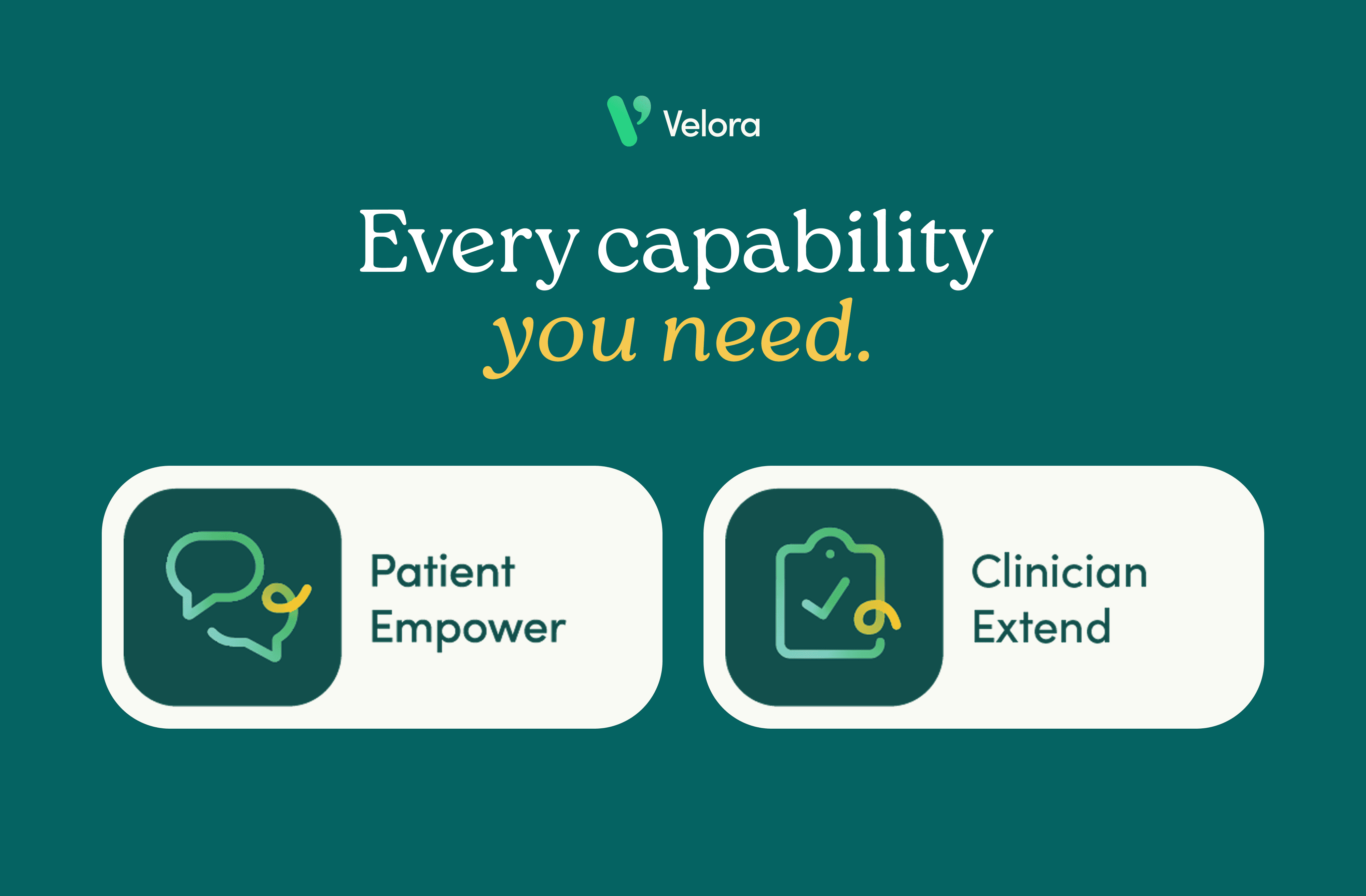
As the product offer grew, Velora became the shared identity for two related offers: Empower for full AI-led therapy and Extend for between-session support in human-delivered care.
That's the Short Version
Continue for a closer look at how the name, identity and brand system developed—and how Velora moved into product and commercial work.
From Broad Principles to a Distinctive Brand
A collaborative process to turn an early set of marketing principles into a warm, credible and flexible identity for Velora.
1
Clarifying the Brand Direction
Translated broad principles into a clearer personality and creative direction that balanced clinical credibility with warmth and optimism.
2
Developing the Visual Identity
Created the logo, colour palette and photography style that gave Velora a distinctive and recognisable character.
3
Connecting Brand and Product
Worked across brand and product design so the identity felt coherent inside the experience, rather than applied only through marketing.
4
Growing into a Product Family
As the product offer grew, Velora became the shared identity for two related offers: Empower for full AI-led therapy and Extend for between-session support in human-delivered care.
That's the Short Version
Continue for a closer look at how the name, identity and brand system developed—and how Velora moved into product and commercial work.
From Broad Principles to a Distinctive Brand
A collaborative process to turn an early set of marketing principles into a warm, credible and flexible identity for Velora.
1
Clarifying the Brand Direction
Translated broad principles into a clearer personality and creative direction that balanced clinical credibility with warmth and optimism.
2
Developing the Visual Identity
Created the logo, colour palette and photography style that gave Velora a distinctive and recognisable character.
3
Connecting Brand and Product
Worked across brand and product design so the identity felt coherent inside the experience, rather than applied only through marketing.
4
Growing into a Product Family
As the product offer grew, Velora became the shared identity for two related offers: Empower for full AI-led therapy and Extend for between-session support in human-delivered care.
That's the Short Version
Continue for a closer look at how the name, identity and brand system developed—and how Velora moved into product and commercial work.
From Broad Principles to a Distinctive Brand
A collaborative process to turn an early set of marketing principles into a warm, credible and flexible identity for Velora.
1
Clarifying the Brand Direction
Translated broad principles into a clearer personality and creative direction that balanced clinical credibility with warmth and optimism.
2
Developing the Visual Identity
Created the logo, colour palette and photography style that gave Velora a distinctive and recognisable character.
3
Connecting Brand and Product
Worked across brand and product design so the identity felt coherent inside the experience, rather than applied only through marketing.
4
Growing into a Product Family
As the product offer grew, Velora became the shared identity for two related offers: Empower for full AI-led therapy and Extend for between-session support in human-delivered care.
That's the Short Version
Continue for a closer look at how the name, identity and brand system developed—and how Velora moved into product and commercial work.
From Broad Principles to a Distinctive Brand
A collaborative process to turn an early set of marketing principles into a warm, credible and flexible identity for Velora.
1
Clarifying the Brand Direction
Translated broad principles into a clearer personality and creative direction that balanced clinical credibility with warmth and optimism.
2
Developing the Visual Identity
Created the logo, colour palette and photography style that gave Velora a distinctive and recognisable character.
3
Connecting Brand and Product
Worked across brand and product design so the identity felt coherent inside the experience, rather than applied only through marketing.
4
Growing into a Product Family
As the product offer grew, Velora became the shared identity for two related offers: Empower for full AI-led therapy and Extend for between-session support in human-delivered care.
That's the Short Version
Continue for a closer look at how the name, identity and brand system developed—and how Velora moved into product and commercial work.
Velora Brand
Velora Brand
Velora Brand
Velora Brand
Closer Look · About 6 min · 4 chapters
01
Creating Velora’s Brand Identity
The programme needed a public identity people could recognise and trust. Working with Marketing, I helped shape the Velora name and positioning, then developed the logo, colour palette, photography style and wider visual language. Together, these made AI-led therapy feel warm, hopeful and human without losing clinical credibility.
01
Creating Velora’s Brand Identity
The programme needed a public identity people could recognise and trust. Working with Marketing, I helped shape the Velora name and positioning, then developed the logo, colour palette, photography style and wider visual language. Together, these made AI-led therapy feel warm, hopeful and human without losing clinical credibility.

The mark brings therapy, technology and care together: a conversational form, a subtle code-like slash and a shape that can also be read as a heart.

A small set of colour treatments kept the logo clear across light and dark backgrounds.

An extended palette added flexibility without losing the recognisable teal-and-green foundation.
The mark brings therapy, technology and care together: a conversational form, a subtle code-like slash and a shape that can also be read as a heart.
A small set of colour treatments kept the logo clear across light and dark backgrounds.
An extended palette added flexibility without losing the recognisable teal-and-green foundation.
The mark brings therapy, technology and care together: a conversational form, a subtle code-like slash and a shape that can also be read as a heart.
A small set of colour treatments kept the logo clear across light and dark backgrounds.
An extended palette added flexibility without losing the recognisable teal-and-green foundation.

The creative direction balanced warmth and optimism with a calm, clinically credible foundation.
The creative direction balanced warmth and optimism with a calm, clinically credible foundation.
The creative direction balanced warmth and optimism with a calm, clinically credible foundation.

A soft but sturdy serif brought credibility, while the warmer sans serif kept everyday communication approachable.
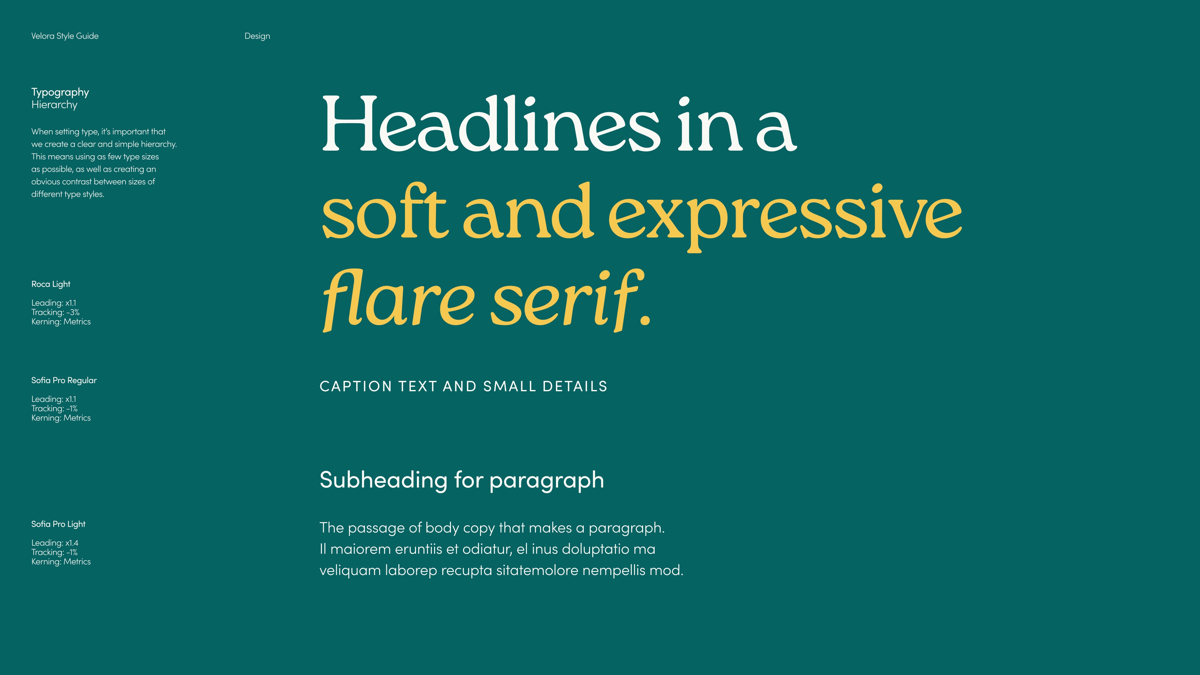
Headlines used generous scale and a softer serif to make the brand feel more human.

The hand-drawn line connected the wider identity to the animation and movement already used inside the product.
A soft but sturdy serif brought credibility, while the warmer sans serif kept everyday communication approachable.
Headlines used generous scale and a softer serif to make the brand feel more human.
The hand-drawn line connected the wider identity to the animation and movement already used inside the product.
A soft but sturdy serif brought credibility, while the warmer sans serif kept everyday communication approachable.
Headlines used generous scale and a softer serif to make the brand feel more human.
The hand-drawn line connected the wider identity to the animation and movement already used inside the product.

Film-like, imperfect photography added warmth and texture, balancing the polish of the digital product.

The speech-mark treatment made portraits feel distinctive while keeping people at the centre.

The photography style favoured optimistic, unforced moments over polished healthcare imagery.
Film-like, imperfect photography added warmth and texture, balancing the polish of the digital product.
The speech-mark treatment made portraits feel distinctive while keeping people at the centre.
The photography style favoured optimistic, unforced moments over polished healthcare imagery.
Film-like, imperfect photography added warmth and texture, balancing the polish of the digital product.
The speech-mark treatment made portraits feel distinctive while keeping people at the centre.
The photography style favoured optimistic, unforced moments over polished healthcare imagery.
02
Turning the Identity into a Usable Brand System
I turned the core identity into reusable guidance, assets and patterns for Product, Marketing and Commercial teams. The system created consistency without making every application look identical.
02
Turning the Identity into a Usable Brand System
I turned the core identity into reusable guidance, assets and patterns for Product, Marketing and Commercial teams. The system created consistency without making every application look identical.
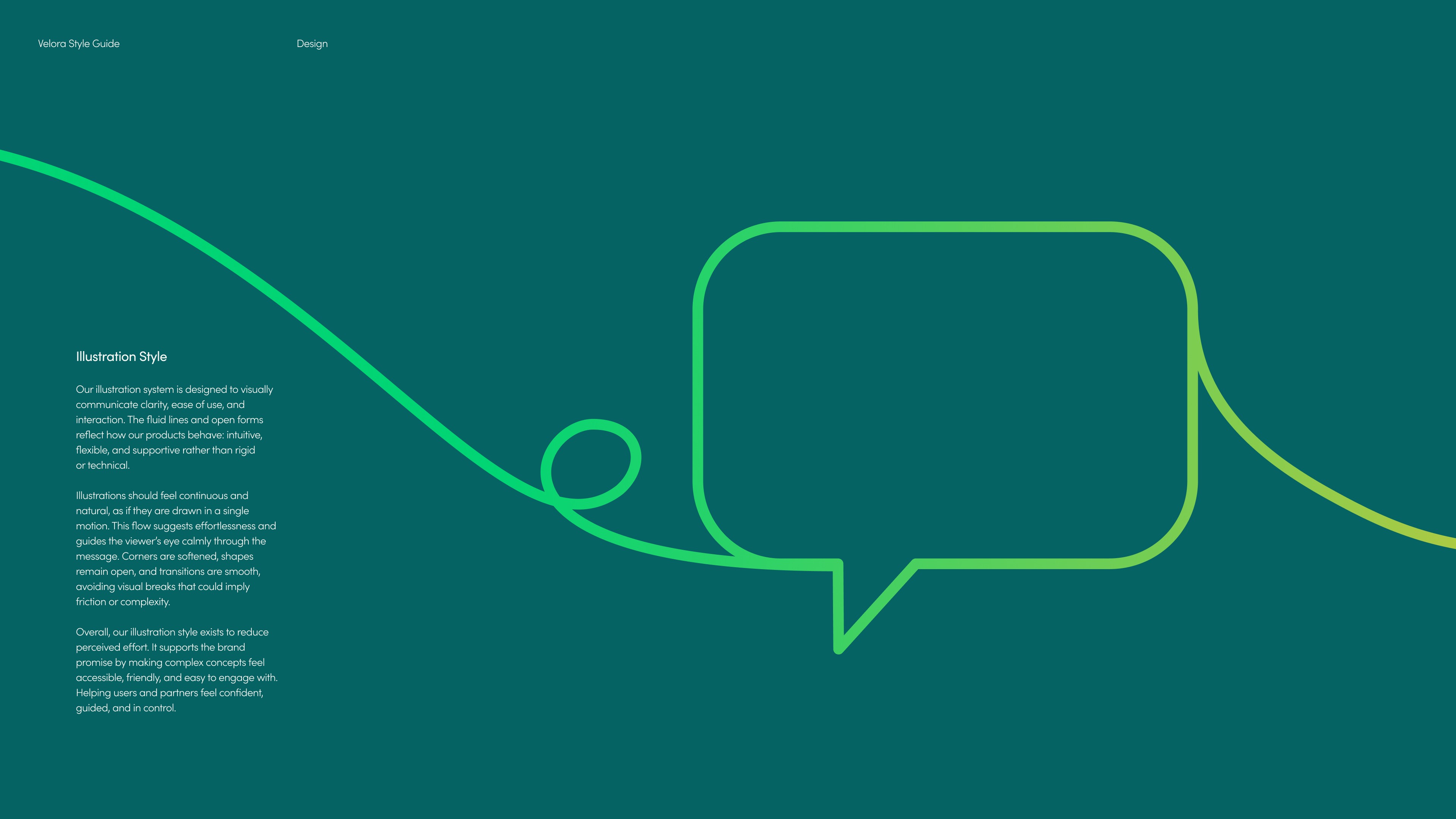
Reusable motifs gave teams a recognisable starting point without prescribing a single layout.
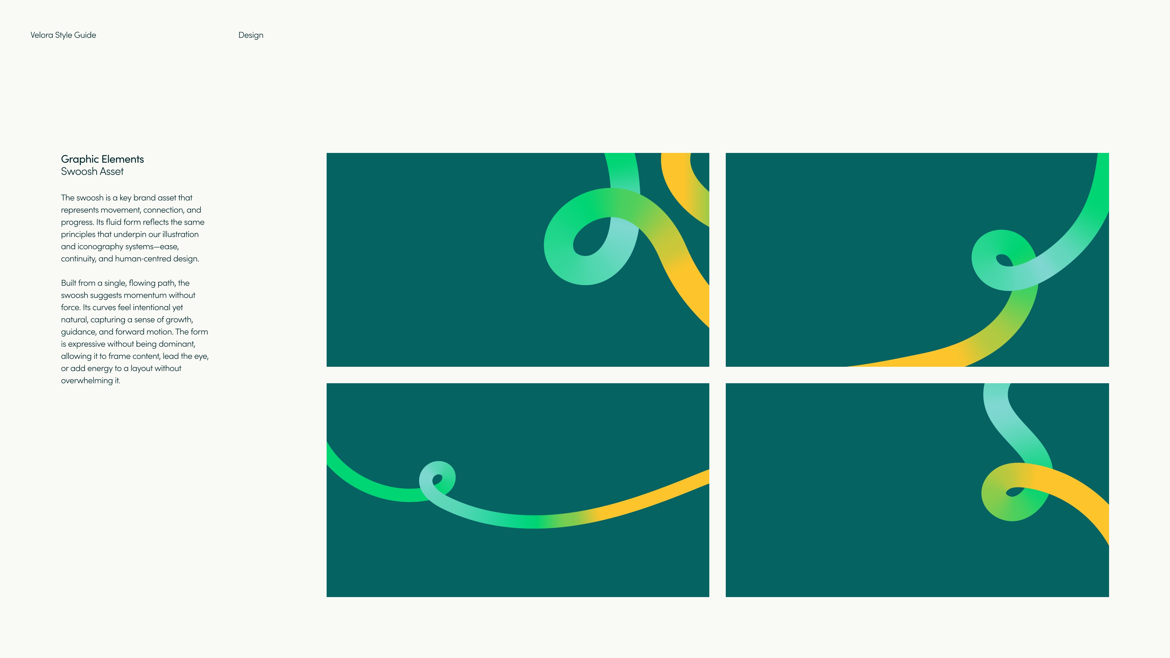
The line motif could flex between expressive illustration and functional layout.

A shared icon style helped product and marketing materials feel part of the same system.
Reusable motifs gave teams a recognisable starting point without prescribing a single layout.
The line motif could flex between expressive illustration and functional layout.
A shared icon style helped product and marketing materials feel part of the same system.
Reusable motifs gave teams a recognisable starting point without prescribing a single layout.
The line motif could flex between expressive illustration and functional layout.
A shared icon style helped product and marketing materials feel part of the same system.
03
Putting the Brand to Work
The real test was whether the identity could hold together across the mobile product, website, customer presentations, sales materials and campaigns. Working with our Brand Designer and Marketing, I helped establish a consistent way for Velora to speak to consumers, partners and internal teams.
03
Putting the Brand to Work
The real test was whether the identity could hold together across the mobile product, website, customer presentations, sales materials and campaigns. Working with our Brand Designer and Marketing, I helped establish a consistent way for Velora to speak to consumers, partners and internal teams.
The identity carried into the mobile product through colour, typography, illustration and tone of voice.

Sales materials gave commercial teams a consistent way to explain Velora to healthcare partners.

Presentation templates kept customer stories recognisably Velora.
The identity carried into the mobile product through colour, typography, illustration and tone of voice.
Sales materials gave commercial teams a consistent way to explain Velora to healthcare partners.
Presentation templates kept customer stories recognisably Velora.
The identity carried into the mobile product through colour, typography, illustration and tone of voice.
Sales materials gave commercial teams a consistent way to explain Velora to healthcare partners.
Presentation templates kept customer stories recognisably Velora.
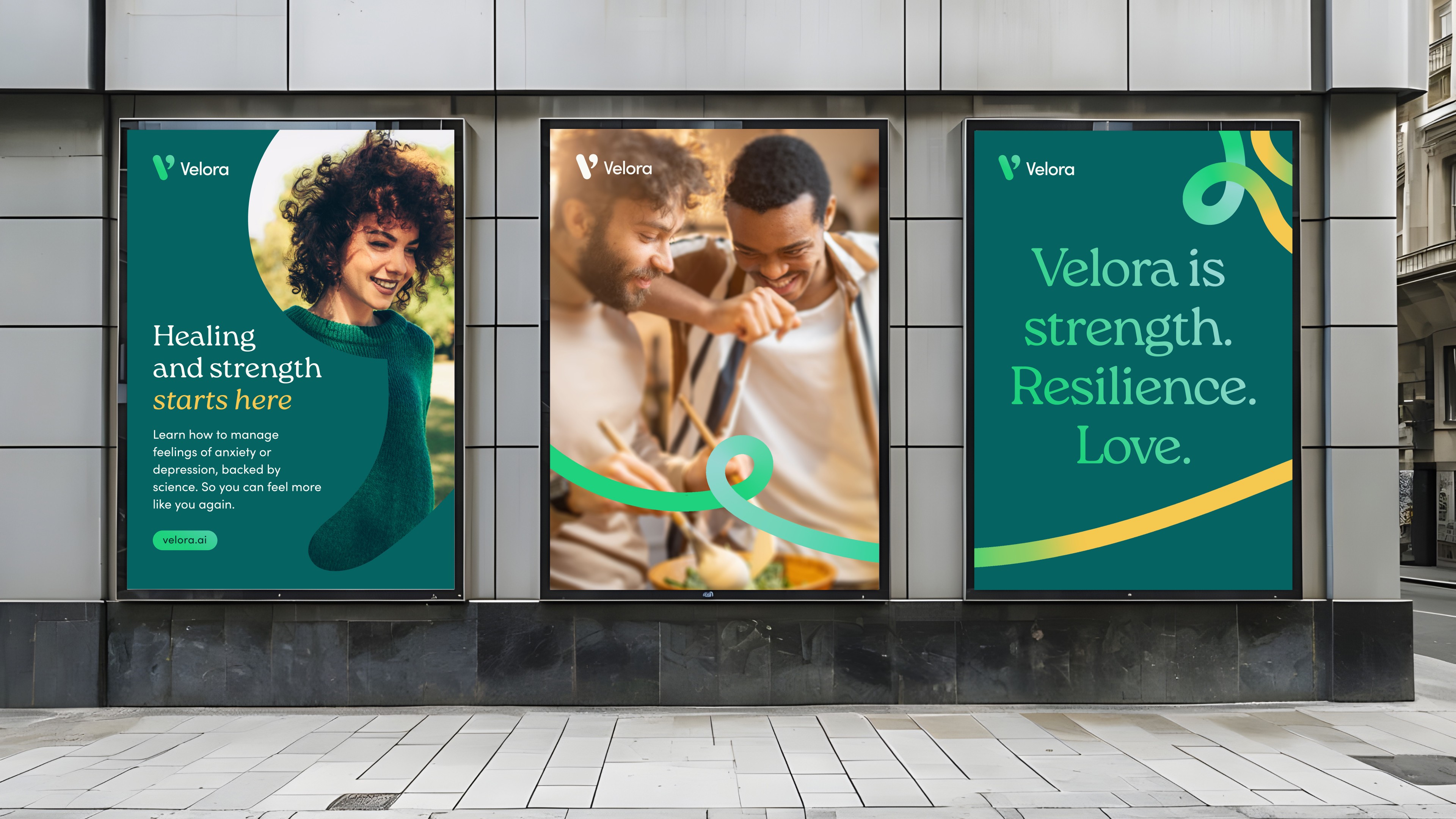
Campaign materials used Velora’s colours, photography and tone of voice to introduce the product to potential users.

The identity also extended into launch materials and internal merchandise.
04
Building a Velora Product Family
As the offer developed, Velora expanded into Empower for AI-led therapy, Extend for support alongside human-delivered care and Evaluate for clinical assessment. Each needed a clear role of its own while retaining the shared foundation that made the family recognisable.
04
Building a Velora Product Family
As the offer developed, Velora expanded into Empower for AI-led therapy, Extend for support alongside human-delivered care and Evaluate for clinical assessment. Each needed a clear role of its own while retaining the shared foundation that made the family recognisable.

Empower and Extend used distinct expressions while retaining the shared Velora name and visual foundation.
Empower and Extend used distinct expressions while retaining the shared Velora name and visual foundation.
Empower and Extend used distinct expressions while retaining the shared Velora name and visual foundation.
A Fast Start With Room to Grow
The product was already well developed when I created Velora’s core identity—in just two days. That speed was possible because Sales, Marketing and Design had first agreed the values and principles it needed to express. It gave me a concrete brief to design against, and gave the wider team a shared way to evaluate the work beyond personal taste. Since then, the identity has grown from a consumer-facing therapy brand into something that also supports customer conversations, clinician-facing products and related offers such as Velora Empower and Velora Extend. It is exciting to see it evolve without losing its original character. The first identity was created quickly, but it established a strong enough foundation to keep building on.
A Fast Start With Room to Grow
The product was already well developed when I created Velora’s core identity—in just two days. That speed was possible because Sales, Marketing and Design had first agreed the values and principles it needed to express. It gave me a concrete brief to design against, and gave the wider team a shared way to evaluate the work beyond personal taste. Since then, the identity has grown from a consumer-facing therapy brand into something that also supports customer conversations, clinician-facing products and related offers such as Velora Empower and Velora Extend. It is exciting to see it evolve without losing its original character. The first identity was created quickly, but it established a strong enough foundation to keep building on.