EARLIER STUDIO WORK

Independent Brand and Web Work

Independent Brand and Web Work

Independent Brand and Web Work

Before moving in-house, I co-founded and ran a small design studio. I worked directly with clients to shape briefs, develop identities, design websites and carry ideas into print and production.

Before moving in-house, I co-founded and ran a small design studio. I worked directly with clients to shape briefs, develop identities, design websites and carry ideas into print and production.

Before moving in-house, I co-founded and ran a small design studio. I worked directly with clients to shape briefs, develop identities, design websites and carry ideas into print and production.

The projects covered very different businesses, which is precisely why I still value them: each called for its own visual language rather than another variation of the same house style.

The projects covered very different businesses, which is precisely why I still value them: each called for its own visual language rather than another variation of the same house style.

CO-FOUNDER · COMPANY DIRECTOR · BRAND, DIGITAL AND PRINT

CO-FOUNDER · COMPANY DIRECTOR · BRAND, DIGITAL AND PRINT

Café Sesa event poster detail
Bespoke illustration for Ashley Doula
Gold foil business card for The Scenery
Spot UV business cards for iRev

WHAT THIS WORK SHOWS

Different Clients, Different Worlds

Different Clients, Different Worlds

Together, the projects show three parts of the job:

01

A Brand From a Blank Page

Finding the idea, voice and visual language before there was a system to work within.

02

Ideas Carried Into Production

Following the details through websites, illustration, packaging, print and physical finishes.

03

A Studio Run End to End

Working directly with clients, shaping briefs and collaborating with developers, photographers and illustrators.

01 · SELF-INITIATED IDENTITY

Café Sesa

Café Sesa

Starting with a simple idea — music can change how you feel — I developed the name, identity and applications for a coffee shop aimed at music lovers. Menus borrowed the proportions of CD sleeves, event posters echoed gig graphics, and coffee strengths became music genres.

Starting with a simple idea — music can change how you feel — I developed the name, identity and applications for a coffee shop aimed at music lovers. Menus borrowed the proportions of CD sleeves, event posters echoed gig graphics, and coffee strengths became music genres.

Naming, identity, copy and applications

Café Sesa gig-style event poster
Café Sesa CD-sleeve-sized menu
Café Sesa coffee packaging based on music genres

A coherent visual identity built from one central idea.

A coherent visual identity built from one central idea.

02 · CLIENT IDENTITY AND WEBSITE

Ashley Doula

Ashley Doula

Stock photography would have made the site feel generic, so I shaped the identity around Ashley herself, her local area and the 1950s graphics she loved. Working with illustrator Millie Pooley, we turned those references into bespoke scenes, then carried the same warmth through the logo and website.

Stock photography would have made the site feel generic, so I shaped the identity around Ashley herself, her local area and the 1950s graphics she loved. Working with illustrator Millie Pooley, we turned those references into bespoke scenes, then carried the same warmth through the logo and website.

With illustrator Millie Pooley and developer Matt Buckland

Illustrated scene for the Ashley Doula website
Ashley Doula Care logo inspired by Ashley’s personality and 1950s graphics
Ashley Doula website screens

03 · DIGITAL ART DIRECTION

The Willow Tree

The Willow Tree

The pub’s fairytale-like interior was central to its appeal, but its old website didn’t communicate its unique character. We built the new experience around photographed objects from the venue, turning menus, contact details and reservations into a journey through the place itself.

The pub’s fairytale-like interior was central to its appeal, but its old website didn’t communicate its unique character. We built the new experience around photographed objects from the venue, turning menus, contact details and reservations into a journey through the place itself.

Web design and art direction · With developer Matt Buckland and photographer Malcolm Greenhill · Existing identity by another agency

The Willow Tree website presented on a tablet
Photographed objects from inside The Willow Tree used in the website
Contact page from The Willow Tree website

IDENTITY SYSTEM

iRev

For a new B2B technology reseller, I defined the brand’s personality and position, then built an identity that stayed recognisable across everything from small hardware labels to advertising and print.

For a new B2B technology reseller, I defined the brand’s personality and position, then built an identity that stayed recognisable across everything from small hardware labels to advertising and print.

iRev identity mark
iRev typography and colour system
iRev business cards with spot UV finish

RESEARCH, STRUCTURE AND BOOKING

Cambridge Cookery School

Cambridge Cookery School

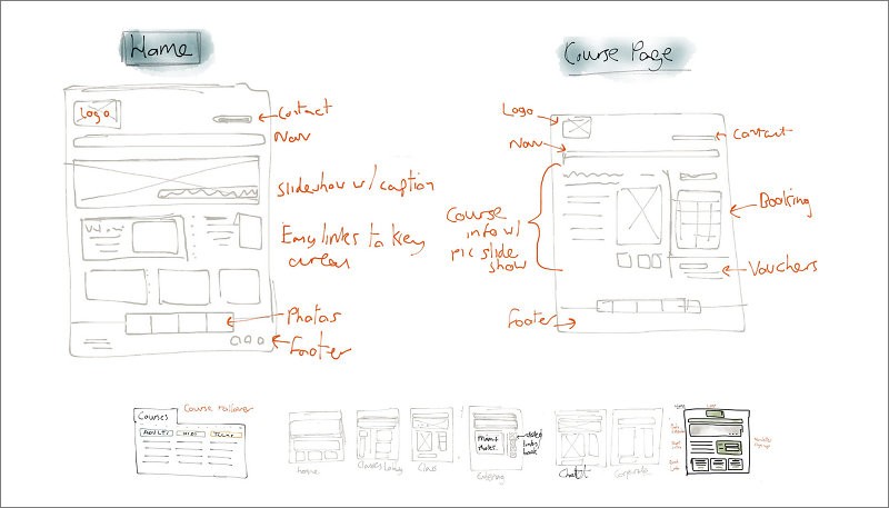
I attended one of their cookery classes, spoke with customers and mapped the different reasons people came to the site. Those findings shaped the information architecture, course filtering and booking journey, connecting the visual redesign to the way people actually found and booked a course.

I attended one of their cookery classes, spoke with customers and mapped the different reasons people came to the site. Those findings shaped the information architecture, course filtering and booking journey, connecting the visual redesign to the way people actually found and booked a course.

Task flows for Cambridge Cookery School customers
Early Cambridge Cookery School wireframes
Revised Cambridge Cookery School visual design

Research and task flows → structure and wireframes → a clearer course and booking experience.

Research and task flows → structure and wireframes → a clearer course and booking experience.

SMALL DETAILS, DIFFERENT PERSONALITIES

Four Identities, Four Different Characters

Four Identities, Four Different Characters

Each began with a distinct idea, carried through typography, materials, packaging, print and web design.

Gold foil business card for The Scenery

IDENTITY AND PRINT

The Scenery

A Victorian show-card influence gave this interior-design identity an established, theatrical character. Gold foil carried that sense of occasion into the business cards.

Textured stationery for The Peagreen Cupboard

IDENTITY AND PACKAGING

The Peagreen Cupboard

A restrained identity for an eccentric online shop, made more personal through handwritten-style type, textured stock, stamps and stickers used across its packaging.

Isleham Preschool logo and green visual identity applied to a letterhead

IDENTITY AND WEB DESIGN

Isleham Preschool

The new logo coincided with the opening of the preschool’s green building. I combined the building’s distinctive roofline with the idea of growth, then carried the mark into stationery and a responsive website I designed and built.

WHAT I CARRIED FORWARD

What Running a Studio Taught Me

What Running a Studio Taught Me

What Running a Studio Taught Me

Working directly with clients meant turning vague ambitions into decisions, explaining those decisions clearly and carrying the details through real budgets, collaborators and production constraints. It still shapes how I work in product teams: listen carefully, make the direction tangible and stay close to delivery so the idea holds together in the finished work.

Working directly with clients meant turning vague ambitions into decisions, explaining those decisions clearly and carrying the details through real budgets, collaborators and production constraints. It still shapes how I work in product teams: listen carefully, make the direction tangible and stay close to delivery so the idea holds together in the finished work.

Working directly with clients meant turning vague ambitions into decisions, explaining those decisions clearly and carrying the details through real budgets, collaborators and production constraints. It still shapes how I work in product teams: listen carefully, make the direction tangible and stay close to delivery so the idea holds together in the finished work.

Back to Selected Projects →

© 2026 - Jack Larner